10×10 Trade Show Booth Ideas for Small Spaces and Strong Brand Visibility
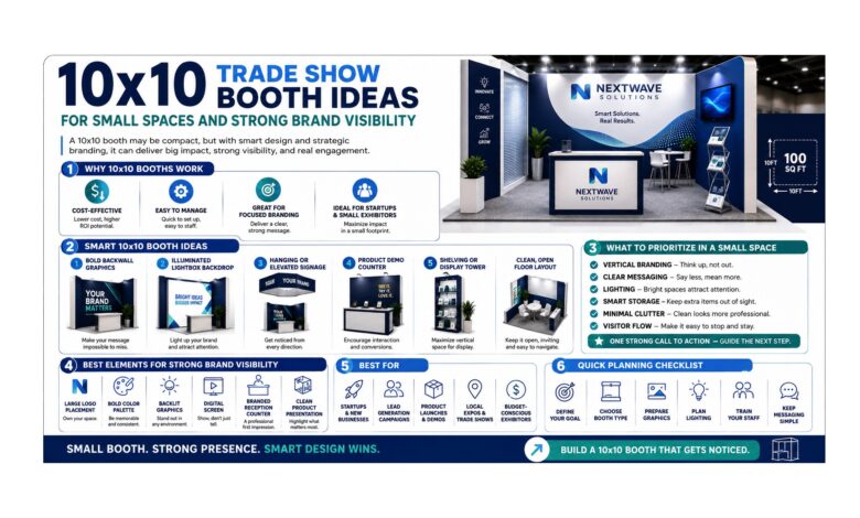
A small trade show booth does not have to make a small impression. In fact, a carefully planned 10×10 exhibit can often feel more focused and memorable than a much larger space packed with too many competing elements. With only 100 square feet available, every graphic, counter, light source, and open pathway needs a reason to be there. That limitation can actually be useful because it encourages you to simplify your message and concentrate attention where it matters most.
The best 10×10 trade show booth ideas for small spaces and strong brand visibility combine smart space planning with bold visual communication. Instead of trying to squeeze an entire showroom into a compact footprint, think of the booth as a carefully framed snapshot. Visitors should understand the main message within seconds, feel comfortable stepping inside, and have enough space to speak with your team without feeling crowded. The following ideas show how to turn a limited footprint into an inviting, professional exhibition space.
10×10 Feet (3×3 Meters): Make Every Square Foot Work
A 10×10 feet (3×3 meters) booth gives you approximately 100 square feet, so smart placement matters more than the number of display components you use. The most successful layouts usually keep the aisle-facing area open and place larger graphics toward the back or sides. This creates an immediate sense of accessibility instead of making visitors feel that they must squeeze around furniture just to enter.
Start with one dominant visual message. A large graphic wall, memorable headline, or featured image can communicate more effectively than several smaller signs scattered around the booth. Keep counters compact and position them where representatives can greet visitors without blocking the entrance. If you need product samples, use vertical display surfaces or small shelves rather than large floor units whenever possible.
Think of the booth like a small living room. If you fill it with oversized furniture, it instantly feels cramped. If you choose a few purposeful pieces and leave open floor space, the same room feels larger and more comfortable. That principle works perfectly on the trade show floor.
10×20 Feet (3×6 Meters): Borrow Ideas Without Overfilling Your Booth
Looking at a 10×20 feet (3×6 meters) layout can provide useful inspiration even when your actual space is 10×10. Larger booths often use clearly defined zones for attention, engagement, and conversation. You can borrow the same idea on a smaller scale without physically dividing the space.
For example, the back wall can function as the attraction zone with a strong graphic. A compact counter near one side can become the engagement zone, while the center remains open for conversation. The result gives visitors a clear visual path even though everything happens within a relatively small area.
The lesson is not to imitate the number of components used in a larger booth. Instead, copy the organizational thinking. A small display feels more polished when visitors instinctively understand where to look and where to stand. Clear visual hierarchy can make a 10×10 footprint feel surprisingly organized and spacious.
20×20 Feet (6×6 Meters): Use Big-Booth Thinking in a Small Footprint
A 20×20 feet (6×6 meters) exhibit offers considerably more space, but some of its strongest design principles can still improve a 10×10 booth. Larger displays typically rely on strong focal points, visual consistency, lighting, and clearly planned traffic flow. None of those techniques require hundreds of square feet.
In a compact booth, one focal point is usually enough. Instead of using several competing graphics, choose one main visual element that represents the most important message. Supporting colors and smaller graphics should reinforce that centerpiece rather than distract from it.
You can also borrow the idea of visual depth. A backdrop does not need to feel flat just because the booth is small. Layering a counter, fabric graphic, and carefully positioned lighting can create dimension while preserving floor space. Even subtle differences in height can make the display feel more intentional.
The goal is to capture the confidence of a larger exhibit without copying its physical scale. Strong design is not measured by how much you install; it is measured by how clearly everything works together.
Standard Tension Fabric Kit for Clean Visual Impact
A Standard Tension Fabric Kit can provide a useful design direction when you want large-format graphics without overwhelming a small booth. Tension fabric creates a smooth, continuous visual surface, helping the display feel coordinated rather than assembled from numerous separate signs.
For a 10×10 booth, simplicity is especially valuable. Large fabric graphics allow you to communicate visually while keeping the floor relatively open. Instead of adding multiple freestanding banners, brochure racks, and bulky structures, one well-designed background can carry much of the booth’s identity.
Keep the artwork easy to read from the aisle. A short headline, bold imagery, and clear color contrast generally work better than long blocks of text. Visitors may initially see the booth while walking past, so your design needs to make sense before they stop.
This type of graphic strategy also gives the booth a cleaner appearance. When visual elements feel connected, the entire space can appear larger and more professional.
Backlit LED Lightbox Solution for Stronger Visibility
A Backlit LED Lightbox Solution can help a compact booth attract attention in a visually crowded exhibition hall. Illumination naturally draws the eye, which makes it useful when you want one key graphic or message to stand apart from surrounding displays.
The trick is moderation. A 10×10 booth does not need every surface illuminated. One carefully positioned backlit feature can create a stronger result than several competing light sources. Think of it like using a spotlight on a stage: the contrast helps the audience understand where to look.
Position the illuminated element where it remains visible from the main traffic direction. It might become the backdrop behind a compact counter or sit slightly off-center to create a sense of movement within the display. Surrounding areas can remain visually calmer so the lightbox maintains its impact.
Lighting can also make the booth feel more dimensional. A bright graphic against a simpler background creates depth and gives the small footprint a more layered appearance without requiring additional floor structures.
QuicklyShow Contact Us for Smarter Small-Booth Planning
The QuicklyShow Contact Us option can help when you need to turn a 10×10 concept into a practical layout. Small spaces reward precision. Moving a counter only a short distance can change visitor flow, and choosing the wrong display depth can reduce valuable standing room.
Before planning the final arrangement, identify your non-negotiable needs. Decide how many representatives will work inside the booth, whether visitors need to view products, whether demonstrations will happen, and how much storage is required. Those answers should shape the design before decorative elements are considered.
It is also useful to think about the booth during its busiest moment. Imagine several visitors arriving at once. Can newcomers still enter? Can representatives move comfortably? Are important graphics still visible when people are standing in front of them?
A strong 10×10 layout should continue working even when it is active. The space should feel energetic rather than congested.
Use Vertical Space Instead of Filling the Floor
Vertical design is one of the smartest ways to make a compact booth feel more substantial. Graphics, shelving, and illuminated visual elements can communicate plenty of information without occupying the same floor area as tables, large displays, or decorative furniture.
A strong rear wall can act as the visual anchor while leaving the center open for visitors. If product samples need to be displayed, narrow vertical shelves can often use space more efficiently than wide tables. Screens can also be integrated into vertical surfaces rather than placed on separate stands.
Keeping the floor open makes the booth more inviting from the aisle. Visitors can immediately see where they will stand, which lowers the psychological barrier to entering.
Create One Clear Focal Point
A 10×10 booth should answer one visual question immediately: What should visitors notice first? If the answer is unclear, the display probably contains too many competing elements.
Your focal point might be a large fabric graphic, illuminated image, featured product, or concise statement. Whatever you choose, give it enough visual space to dominate naturally. Secondary graphics should support it rather than demand equal attention.
This approach improves visibility because visitors can process the booth quickly. On a busy trade show floor, that simplicity is powerful. People often make decisions in seconds, and a clear focal point gives them an immediate reason to pause.
Keep the Entrance Open and Welcoming
One of the easiest ways to improve a small booth is to remove obstacles from the aisle-facing edge. Large counters positioned directly across the front can make the exhibit feel closed, even if there is enough room to walk around them.
Consider moving a counter toward one side or slightly deeper into the booth. This creates a natural invitation for visitors to step inside rather than forcing conversations to happen entirely from the aisle.
Open entrances also improve visibility. When people walking past can see the full graphic wall and understand the layout, the booth feels larger than it actually is.
Keep Messaging Short and Memorable
A small booth does not need small text everywhere. In fact, the opposite is usually better. Use fewer words, make them larger, and prioritize the message visitors should remember after the event.
Long paragraphs belong in detailed materials, not on a primary booth wall. The main display should create interest quickly, while representatives can provide deeper explanations once someone stops.
Think of your booth message like a road sign. It needs to make sense while people are moving. Clear communication creates confidence, and confidence makes the display feel more professional.
Conclusion
The strongest 10×10 trade show booth ideas for small spaces and strong brand visibility are built around clarity, openness, and intentional design. A compact footprint can be highly effective when large graphics carry the visual message, lighting highlights the most important element, and unnecessary furniture stays off the floor.
Use vertical space whenever possible, establish one strong focal point, and keep the entrance welcoming. Tension fabric can create broad visual impact without consuming valuable floor area, while selective LED illumination can help important graphics stand out in a crowded environment.
Most importantly, design the booth for people rather than objects. Visitors need room to enter, stop, talk, and leave comfortably. When every square foot supports that experience, a 10×10 booth can feel focused, polished, and far more memorable than its dimensions suggest.